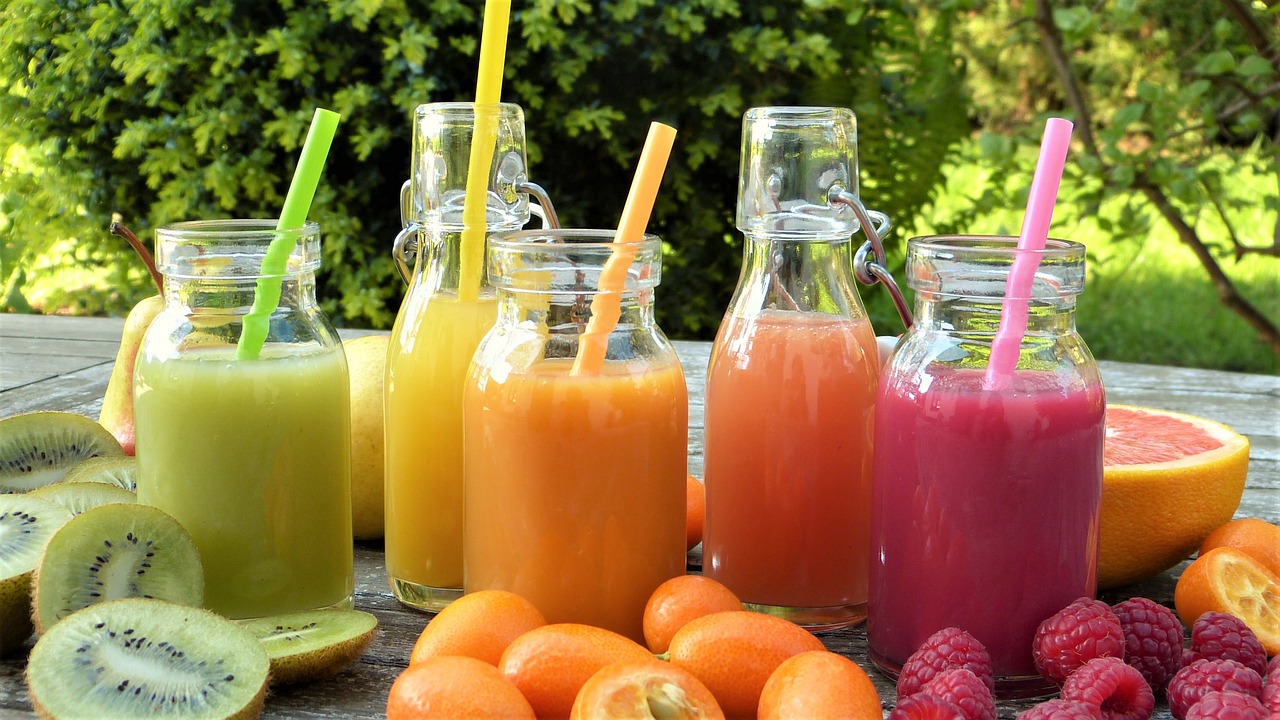
In the bustling world of food and beverages, it’s not just taste that matters. Visual appeal plays a crucial role in enticing consumers and influencing their choices. Colours, in particular, profoundly impact our perception of food and drinks. From vibrant packaging to appetizing plating, the strategic use of colours can evoke emotions, stimulate appetite, and even shape our overall dining experience. In this article, we explore the fascinating realm of colours in the food and beverages sector and how consumers respond to them.
The Psychology of Colors:
Colours have long been recognized for their ability to evoke specific emotions and psychological responses. Different hues can evoke appetite, freshness, indulgence, or even health-consciousness. Understanding the psychology behind colours helps food and beverage businesses create captivating visual experiences for their consumers. For instance:
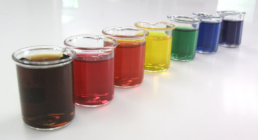
– Warm colours like red and orange can stimulate appetite, create a sense of urgency, and convey energy and excitement.
– Cool colours like green and blue are often associated with freshness, health, and tranquility.
– Earthy tones like brown and beige evoke a sense of comfort, warmth, and reliability.
Packaging and Branding:
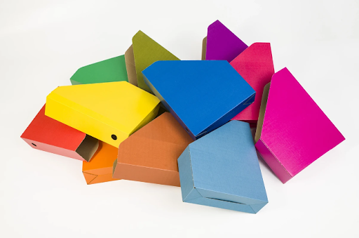
The food and beverages industry invests heavily in packaging and branding to grab consumers’ attention. Colours are pivotal in this process, contributing to brand recognition and influencing purchasing decisions. For example:
– Bright, bold colours are commonly used in snacks and candies to attract children and convey a sense of fun and playfulness.
– Earthy and natural tones dominate packaging for organic and health-oriented products, appealing to consumers seeking wholesome choices.
– Elegantly designed packaging with gold or silver accents can create a premium and luxurious perception, influencing consumers looking for indulgent experiences.
Package Design and Presentation:
Food product manufacturers leverage the visual impact of colours to enhance the user experience. Packaging design and food presentation are meticulously crafted to create an appetizing and memorable encounter. Consider the following practices:
– Contrasting colours often highlight key ingredients or add visual interest to a dish, making it appealing and enticing.
– Vibrant and diverse colour palettes in salads and fresh produce emphasize freshness, health, and variety, appealing to health-conscious consumers.
– Dessert packages frequently use warm colors to evoke indulgence, comfort, and satisfaction.
Cultural and Regional Influences:
The perception of colours and their meaning can vary across cultures and regions. Moreover, health concious consumers may relate bright colours in food and drinks with health-destroying properties. Food and beverage businesses must understand these nuances to cater to diverse consumer preferences effectively. For instance:
– In Western cultures, red is often associated with appetite, while white is associated with purity and freshness.
– In Asian cultures, red is considered auspicious and symbolizes luck and prosperity, making it prevalent in festive foods and beverages.
Colours significantly influence the food and beverages sector, shaping consumer responses and purchase decisions. From packaging and branding to menu design and presentation, the strategic use of colours creates captivating visual experiences that engage and entice consumers. Understanding the psychology behind colors and considering cultural and regional influences can help businesses create powerful connections with their target audience. By mastering the art of colour usage, the food and beverages sector can continue to delight and surprise consumers, offering delectable flavors and visually appealing experiences.
Remember, when it comes to food and beverages, it’s not just about what’s on the plate; it’s also about the colours that enhance the entire sensory journey.